Configure a sunburst chart
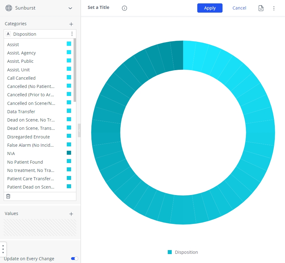
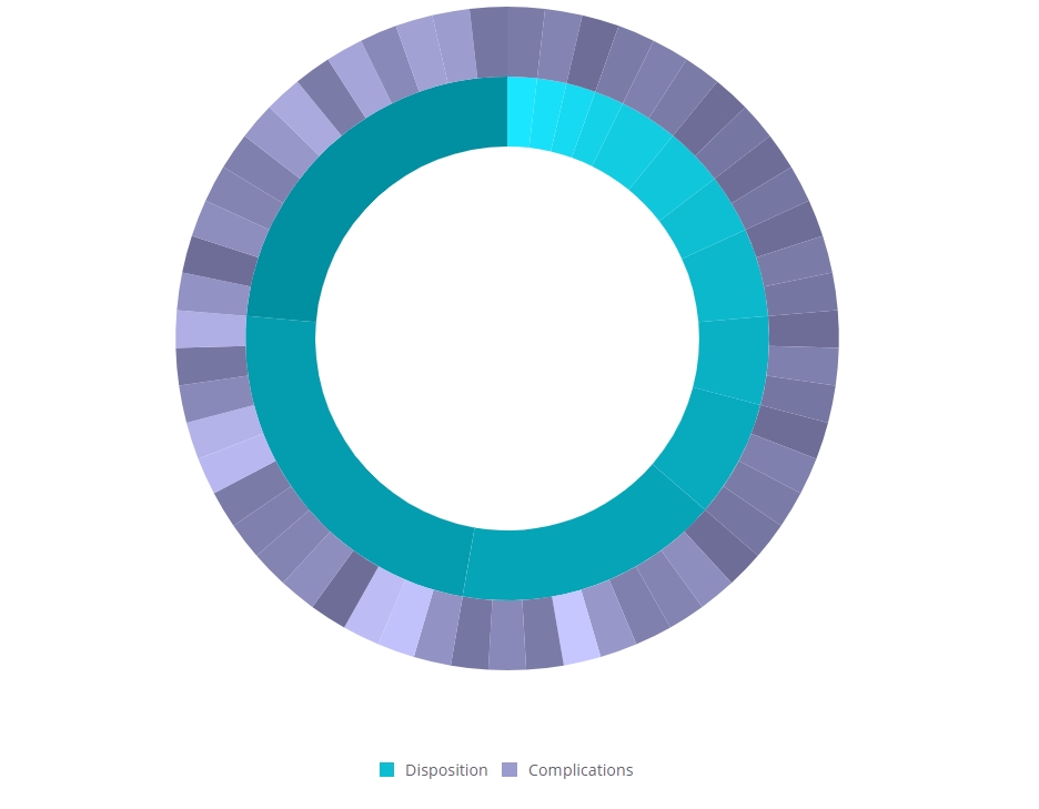
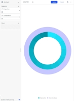
A sunburst chart can display multiple rings, one for each field, to form a hierarchy. Each ring in the sunburst shows a breakdown of its parent ring slice. The innermost circle as the top of the hierarchy. A sunburst chart with multiple levels of categories illustrates how the outer rings relate to the inner rings. A donut or ring chart is a variant of the sunburst chart, containing a blank center that allows for additional information about the data as a whole to be included.
|
|
Click graphics
|
-
 (If you have not done so already) Access the ESO Insights module in the ESO Suite.
-
Do one of the following.
-
(If you are already working in the ESO Suite) Click the Home icon in the upper left corner of the screen.
-
(If you have not yet logged in) Log in to the ESO Suite.
-
In a web browser, go to https://www.esosuite.net/EsoSuite.
The ESO Suite login screen appears.
-
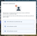
Enter your user name, password, and agency name, then click Let's Go.
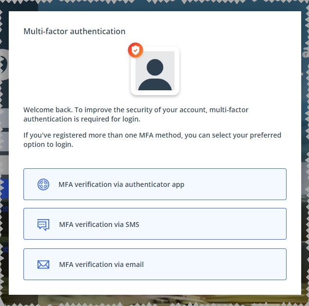
If MFA is enabled, the Multi-factor authentication dialog box appears, displaying one or more methods you can use to verify your login credentials. The number of methods that appear in the dialog box depends on what MFA methods your ESO Suite administrators enabled in the Admin module.
Click graphics
to open them.Information on enabling MFA and specific MFA methods is available in the Admin module online help, in Configure multiple-factor authentication.
Note: If your ESO Suite administrators have disabled MFA ("opted-out"), this dialog does not appear.
-
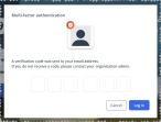
(If the Multi-factor authentication dialog box appears) Depending on which buttons appear in the dialog box, verify your login in one of the following ways.
With an authenticator application.
-
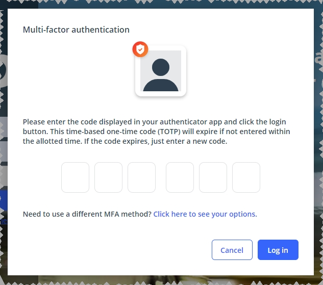
Click MFA verification via authenticator app.
The dialog box updates with boxes for entering the numbers of the authentication code, and the ESO Suite sends an authentication code to the authenticator application installed on your device.

-
Open your authenticator application and note the authentication code currently displayed.
-
Enter the authentication code displayed in the authenticator application.
-
Click Log In.
With a text message (SMS).
-
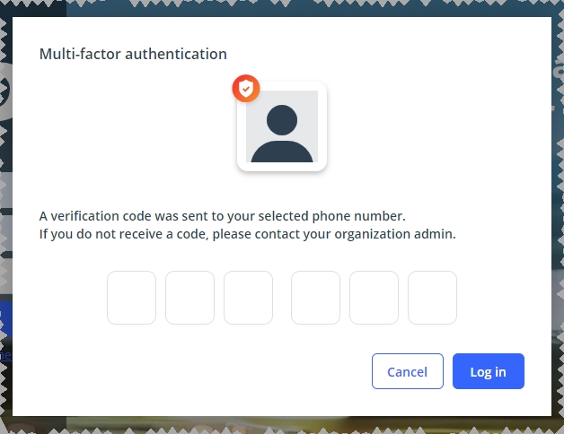
Click MFA verification via SMS.
The dialog box updates with boxes for entering the numbers of the authentication code, and the ESO Suite sends an authentication code to the phone number recorded in your PM records and identified with MFA codes.

-
Enter the authentication code sent to your MFA-registered phone number.
-
Click Log In.
With an email message.
-
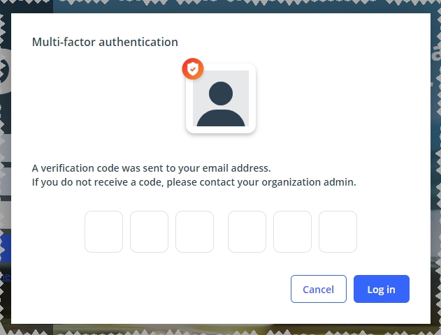
Click MFA verification via email.
The dialog box updates with boxes for entering the numbers of the authentication code, and the ESO Suite sends an authentication code to your agency or department email address, recorded in your PM records.
-
Enter the authentication code sent to your agency or department email address.
-
Click Log In.
-
-
The ESO Suite landing screen appears.
Click graphics
to open them.Note: If MFA is enabled, you can access and manage your MFA options through the PM module, on the Settings > Account page, as described in Manage a user account. If your agency or department has enabled MFA but has not purchased the full-featured version of the PM module, you can access your own MFA settings by clicking Change my Multi-Factor Authentication settings on the landing screen, then using the Settings > Account page that appears. If your agency has not enabled MFA, the Change my Multi-Factor Authentication settings link does not appear on the landing screen.
-
-
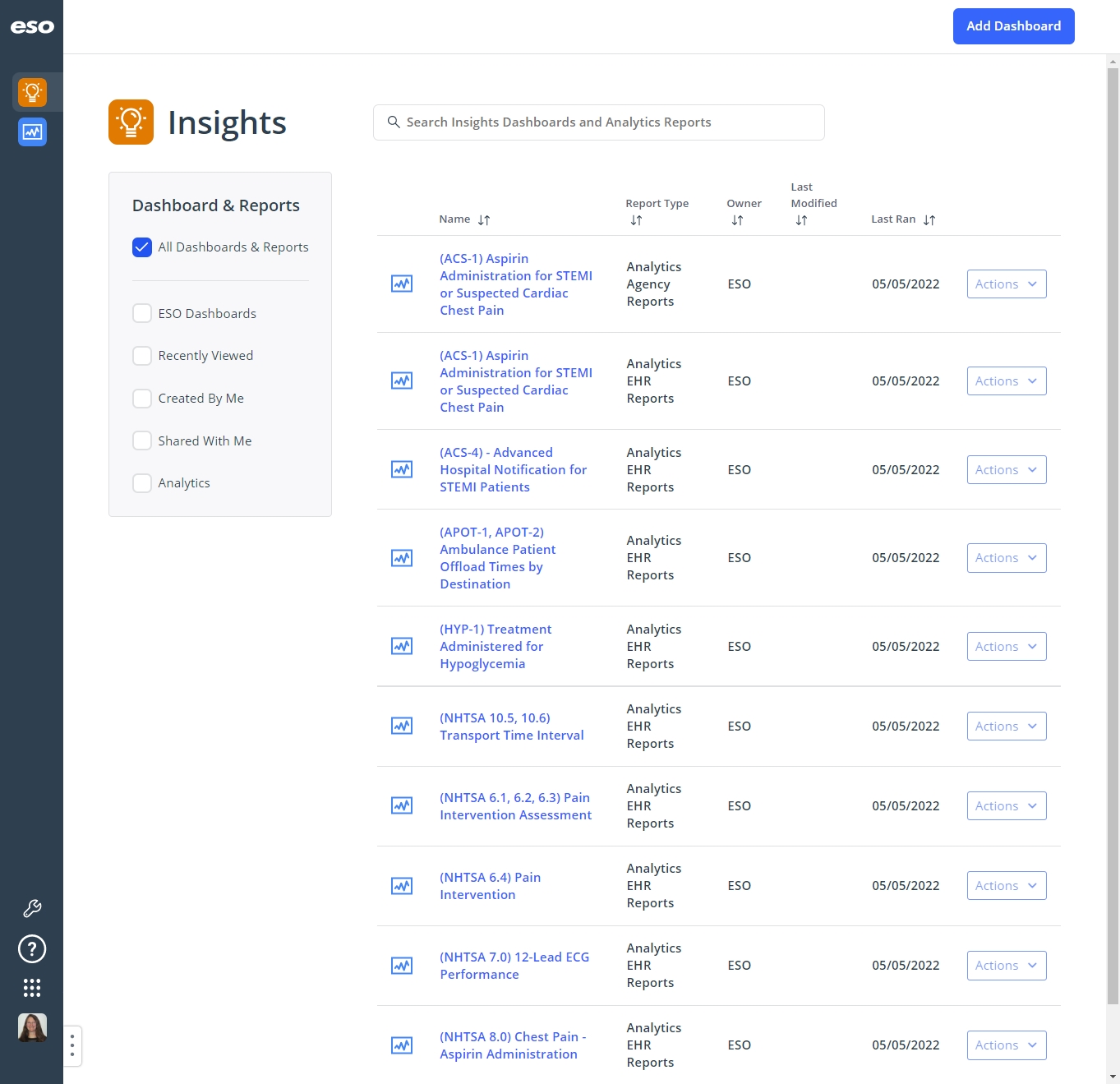
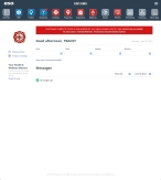
On the top side of the home screen, click Insights.
Tip: If your screen or browser window is too narrow to display all your agency's ESO Suite module icons, an options icon appears on the right side of the icon bar. If you click the options icon, a menu appears containing additional module icons.
-
A list of all the dashboards in the ESO Insights module appears.

The capabilities you have in the ESO Insights module depends on what roles and permissions your ESO Suite administrator assigned to your user account. It also depends on what roles your ESO Insights manager assigned to your user account within the ESO Insights module.
Information on user accounts, roles, and permissions is available in Manage a user account. Information on roles assigned with the ESO Insights module is available in Assign user roles in the ESO Insights module.
-
-
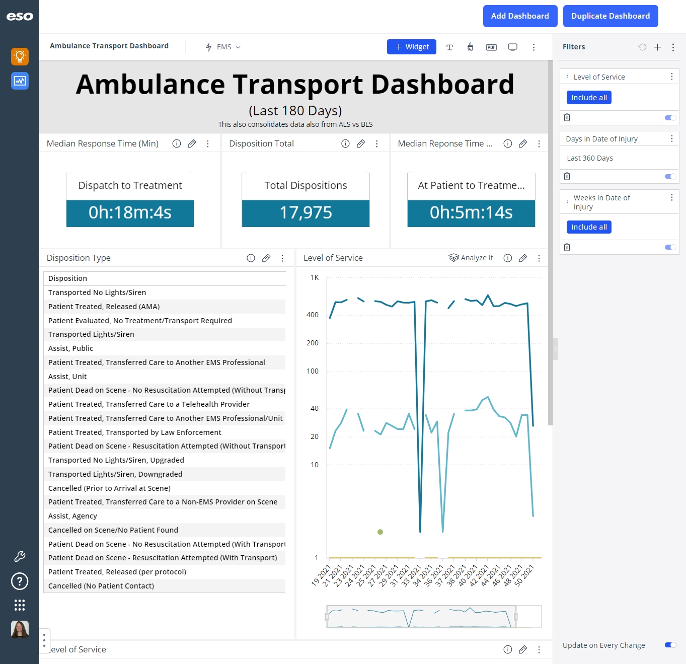
(If you have not done so already) Create or open the dashboard you want to work with.
-
Begin a new dashboard and add a widget to it, as described in Add a new, blank dashboard.
-
Open the dashboard containing the widget you want to work with, as described in Find and open an existing dashboard or report.
The dashboard opens and displays any widgets it contains, and the data those widgets link to.

Click graphics
to open them.
-
-
(If opening an existing dashboard) In the upper right corner of the sunburst chart widget you want to work with, click the edit (
 ) icon.
The widget opens for configuring.
In the left pane, the Categories and Values sections appear. You can add fields to each of these sections, and configure the individual fields to display the precise data you want, in the format you want, in the widget.

In the right pane, the Design and Filters tabs appear. The Design tab contains fields for managing the appearance of chart style, labels, slices, tool tips, legends, axes, and so forth, depending on which type of chart you are working with. The Filters tab contains fields for adding and configuring a widget filter, which applies to the specific sections in the widget and any fields you add to the widget. The center pane displays the effects of these configurations on the data in the widget.
Information on adding and working with a widget filter is available in Configure a widget filter.
Note: Depending on the size of your data source and the how fast data in it updates in real time, you may want to disable data updates to the widget while you are configuring it, to minimize lag time as you work. Real-time data updates in the widget automatically resume when you finish configuring the widget and return to the dashboard,
-
(Optional) In the lower left corner of the screen, drag the Update on Every Change slider button to the left to disable data updates while you configure the widget.
When data updates are enabled, the slider background is blue, the widget re-queries data from the database, and refreshes the data in the widget while you are configuring the widget. Depending on the rate of data change for fields you add to the widget, continuous updates can slow down responsiveness to your widget updates.
When you disable data updates, the slider background turns gray and the data does not update until you click Apply in the upper right corner of the widget and return to the dashboard list.

-
Add a field to a section.
While several different sections may appear in the left pane, the process for adding fields to any section is the same. In many cases, the center pane immediately reflects the data for the field you added; in some cases, you may need to add a field to another section as well before data appears in the center pane.
Example: For pivot table widgets, data appears in the center pane as soon as you add the first field to the Rows or Categories sections. For line and area chart widgets, the center pane does not display data until you also add a field to the Values section.
-
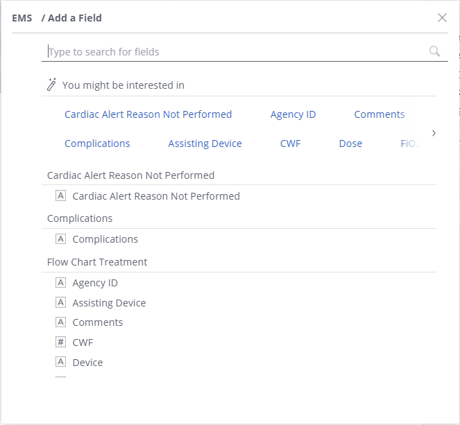
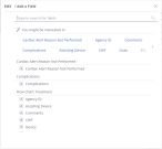
In the left pane, in the section you want to add a field to, click the plus icon (
 ).
).The <data source> / Add a Field dialog box appears, displaying the list of tables and fields available from that data source. The icon to the left of a field name indicates the type value that field contains (alphabetic characters, numbers, dates, and so forth).
-
In Type to search for fields, begin typing characters in the name of the field you want to find.
As you type, the list of fields reduces to only those whose names still match the characters you are typing.

-
Click the name of a field you want to display in the widget.
The field appears in the left pane, under the section you added it to, and the center pane may update to include values from the field.

Tip: If you hover your mouse pointer over the name of the field, a pop-up appears containing information about what row and column the widget will draw data from in the data source.

Note: In some sections, you create and edit formulas for each value, so that you can refine the data in the widget to show precisely what you need. This formula capability appears as a value indicator before the field name.

-
Repeat the previous three steps to add additional fields to the section as needed
Additional fields appear in the section as separate entries, and the center pane updates to include data from the additional fields.
-
-
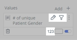
Work with a field's data.
Once you add fields to a widget, you can work with the individual fields in a number of ways, such as filtering and sorting values, formatting numbers, changing colors, performing calculations with formulas, and so forth. You can also rename and duplicate fields, synchronize measurements with filters, format units as time duration, work with field hierarchies, and more. You can access the features specific to each field through menu options and icons that appear when you hover the mouse over the field.


Note: The icons and options that appear for each field depend on the type of widget you are adding the field to, the widget section you add the field to, and what type of field (number, time, or date) it is.
Example: Icons that can appear.
For pivot tables, in the Rows section, if you add a number field (such as the
Patient Gender), then hover the mouse pointer over this field, the filter ( ) and sort (
 ) icons appear in the field listing. If you add the same field to the Columns section and hover the mouse over it, only the filter () icon appears.
If you add a time field (such as
Time to First CPR) to the Rows section, the filter (), format ( ), and sort () icons appear. If you add the same field to the Columns section and hover the mouse over it, only the filter () icon and format () icons appear.
If you add a date field (such as
Stroke Last Known Well Date Time) to the Rows section, the filter (), calendar ( ), and sort () icons appear. If you add the same field to the Columns section, only the filter () and calendar () icons appear.
In the Values section, the edit (
), filter (), and format () icons appear for all three types of fields .
Example: Menu options that can appear.
In pivot tables, in the Rows and Columns sections, if you add a number field (such as the
Patient Gender) or a date field (such asStroke Last Known Well Date Time), then click the menu icon to the right of the field name, the menu that appears contains options specific to that field and section. If you add the same field to the Columns section and click the menu icon, all the same options appear except for Show as Images. If you add a time field (such asTime to First CPR) to these sections and click their respective menu icons, the menus that appears are the same as for the number and date fields, and contain the additional Format as Time Duration option.
If you add the three different types of fields to the Values section and click the menu icon to the right of the field name, only three of the options that appear for the fields in the Rows and Columns sections appear in the menu, and three new options appear. In the Values section, all the same options appear for the three fields, except for the time field, which has the additional Format as Time Duration option.

-
Work with the features below that apply to the field.
Note: Only the icons and menu options that appear for fields in this widget are listed below .
A full listing of all the icons and menu options that can appear in the different widgets, and the steps for working with those icons and fields, is available in Work with field icons and Work with field menu options.
Filter the field values.
-
Hover your mouse pointer over the name of the field, until icons appear in the field's listing.
-
Click the filter (
) icon.The Filter <field name> / Filter a Field dialog box appears.

-
In the left pane, choose the name of the type of filter you want to apply to the field.
Example: For the Patient Gender field, the List filter is selected by default, and the possible values that could appear in a list for this field appear in the right pane, and include
Female,Male,Unknown (Unable to Determine, andN/A. If you choose the Text filter in the left pane, the field in the right pane updates to let you create a logical expression to filter with instead.
-
In the right pane, clear and make selections, or fill out the fields that appear as needed, to filter the field's values down to only the ones you want to display on the dashboard.
-
Click OK.
Format number values.
-
Hover your mouse pointer over the name of the field, until icons appear in the field's listing.
-
Click the format number (
) icon. The <SQL formula> > Format Number dialog box appears.

-
Use the dialog box to define the format used for that value.
The format can include the number of places after a decimal point, the inclusion of dollar or percent signs, and so forth.

 Format calendar values.
-
Hover your mouse pointer over the name of the field, until icons appear in the field's listing.
-
Click the format number (
) icon. The <field name> > Format Date dialog box appears.

-
Use the dialog box to define the format used for that calendar value.
The format is the calendar unit (years, months, weeks, days, and so forth), and the presentation of the unit (2/10/2022, February 10, 2022, and so forth).
Edit the field values.
The formulas used to track values in the data source are SQL formulas, and are similar to Excel formulas. You can edit the formulas as needed to pinpoint the data you are looking for in the values.
-
Hover your mouse pointer over the name of the field, until icons appear in the field's listing.
-
Click the edit (
) icon. The <data source> / Edit Formula dialog box appears.

-
In the formula box at the top of the dialog box, edit the formula to suit your needs.
Example: For the
# of unique Patient Gendervalue, the formulaCOUNT([Gender])counts only unique instances of each gender value (Female, Male, Unknown, N/A) in the data set. In the pie chart widget, this results in a1for each possible gender values, because the first (unique) occurrence value of the value is counted, and the rest of the occurrences (not unique) are ignored.
If you change the formula to
DUPCOUNT([Gender]), every instance of that value, in every row of the data set, is counted. This results in an accurate count of each patient gender value in the data set.
-
Click OK.
The values in the widget update to reflect the changes you made in the dialog box.
 Rename the field.
-
Click the field's menu icon.
A pop-up menu appears to the right of the field.

-
From the pop-up menu, choose Rename.
The field name highlights, and a green (save) check mark icon and a red circle (cancel) icon appear to the right of the field name.

-
Edit the text of the field name as needed.
-
Click the green check mark (
 ) icon to save your changes.
Duplicate the field.
-
Click the field's menu icon.
A pop-up menu appears to the right of the field.
-
From the pop-up menu, choose Duplicate.
The ESO Insights module copies the field in the widget, and a new field appears, with a
(1)appended to the name to identify it as the duplicated field.
-
Rename the duplicated field to prevent confusion in the future.
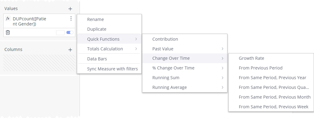
Choose a quick function for the value.
Quick functions instantly add a time dimension to any existing value and formula. These functions include calculations for past values, change over time, contribution and running totals.
Example: A finance manager reviewing total costs per month and needs to track the accumulated annual costs can select a quick function to calculate the year-to-date total for costs.
-
Click the value's menu icon.
A pop-up menu appears to the right of the value.

-
From the field's pop-up menu, choose Quick Functions, then choose an option from the menu extensions that appear.

Format as time duration.
-
Click the field's menu icon.
A pop-up menu appears to the right of the field.
-
From the field's pop-up menu, choose Format as Time Duration.
That field's values in the widget update and appear in the
HH:MM:SStime format.
-
-
-
(If necessary) Delete the field.
-
In the lower left corner of the field, click the delete (trash can) icon.

The ESO Insights module removes the field from the section.
-
-
In the upper right corner of the widget, click Apply.
The ESO Insights module saves the configurations and changes you made to the widget, and applies them to the dashboard you are creating or the existing dashboard you opened. The list of all the dashboards in the ESO Insights module appears.