Work with field icons
Once you add fields to a widget, you can work with the individual fields in a number of ways, such as filtering and sorting values, formatting numbers, changing colors, editing field formulas, and so forth. You can access icons specific to each field when you hover the mouse over the field.
|
Click graphics
|
Note: The icons that appear for each field depend on the type of widget you are adding the field to, the widget section you add the field to, and what type of field (number, time, or date) it is.
For pivot tables, in the Rows section, if you add a number field (such as the Patient Gender), then hover the mouse pointer over this field, the filter (![]() ) and sort (
) and sort (![]() ) icons appear in the field listing. If you add the same field to the Columns section and hover the mouse over it, only the filter (
) icons appear in the field listing. If you add the same field to the Columns section and hover the mouse over it, only the filter (![]() ) icon appears.
) icon appears.
If you add a time field (such as Time to First CPR) to the Rows section, the filter (![]() ), format (
), format (![]() ), and sort (
), and sort (![]() ) icons appear. If you add the same field to the Columns section and hover the mouse over it, only the filter (
) icons appear. If you add the same field to the Columns section and hover the mouse over it, only the filter (![]() ) icon and format (
) icon and format (![]() ) icons appear.
) icons appear.
If you add a date field (such as Stroke Last Known Well Date Time) to the Rows section, the filter (![]() ), calendar (
), calendar (![]() ), and sort (
), and sort (![]() ) icons appear. If you add the same field to the Columns section, only the filter (
) icons appear. If you add the same field to the Columns section, only the filter (![]() ) and calendar (
) and calendar (![]() ) icons appear.
) icons appear.
In the Values section, the edit (![]() ), filter (
), filter (![]() ), and format (
), and format (![]() ) icons appear for all three types of fields .
) icons appear for all three types of fields .
-
Hover your mouse pointer over the name of the field, until icons appear in the field's listing.
-
Depending on which icons appear, do any of the following.

 Filter the field values.
-
Hover your mouse pointer over the name of the field, until icons appear in the field's listing.
-
Click the filter (
 ) icon.
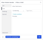
The Filter <field name> / Filter a Field dialog box appears.
-
In the left pane, choose the name of the type of filter you want to apply to the field.
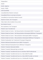
Example: For the Patient Gender field, the List filter is selected by default, and the possible values that could appear in a list for this field appear in the right pane, and include
Female,Male,Unknown (Unable to Determine, andN/A. If you choose the Text filter in the left pane, the field in the right pane updates to let you create a logical expression to filter with instead. -
In the right pane, clear and make selections, or fill out the fields that appear as needed, to filter the field's values down to only the ones you want to display on the dashboard.
-
Click OK.

 Sort the field values.
-
Hover your mouse pointer over the name of the field, until icons appear in the field's listing.
-
Click the sort (
 ) icon, then choose an option from the menu that appears.
Depending on your selection, the possible values for the field sorts from A–Z or from 1 to the highest numerical value, or it sorts from Z–A or from the highest numerical value to 1.
If you choose No sort, the values return to their default order.

 Format number values.
-
Hover your mouse pointer over the name of the field, until icons appear in the field's listing.
-
Click the format number (
 ) icon.
 The <SQL formula> > Format Number dialog box appears.
-
Use the dialog box to define the format used for that value.
The format can include the number of places after a decimal point, the inclusion of dollar or percent signs, and so forth.

 Format calendar values.
-
Hover your mouse pointer over the name of the field, until icons appear in the field's listing.
-
Click the format number (
 ) icon.
 The <field name> > Format Date dialog box appears.
-
Use the dialog box to define the format used for that calendar value.
The format is the calendar unit (years, months, weeks, days, and so forth), and the presentation of the unit (2/10/2022, February 10, 2022, and so forth).

 Edit the field values.
The formulas used to track values in the data source are SQL formulas, and are similar to Excel formulas. You can edit the formulas as needed to pinpoint the data you are looking for in the values.
-
Hover your mouse pointer over the name of the field, until icons appear in the field's listing.
-
Click the edit (
 ) icon.
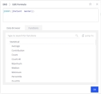
 The <data source> / Edit Formula dialog box appears.
-
In the formula box at the top of the dialog box, edit the formula to suit your needs.
Example: For the
# of unique Patient Gendervalue, the formulaCOUNT([Gender])counts only unique instances of each gender value (Female, Male, Unknown, N/A) in the data set. In the widget, this results in a1for each possible gender values, because the first (unique) occurrence value of the value is counted, and the rest of the occurrences (not unique) are ignored.If you change the formula to
DUPCOUNT([Gender]), every instance of that value, in every row of the data set, is counted. This results in an accurate count of each patient gender value in the data set. -
Click OK.
The values in the widget update to reflect the changes you made in the dialog box.

 Change value direction.
-
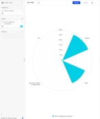
In the lower right corner of the value listing, click the direction icon, then choose a direction option from the menu that appears.
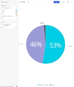
The pie chart updates in the right pane to reflect the value you selected, and the direction icon in the lower right corner of the value listing to match your selection.

 Select a color for the value.
-
In the lower right corner of the field, to the left of the slider, click the color icon.
Note: In some sections, the color icon may be a white button with the word
autoon it, or a display a color gradient.The <SQL formula> > Color dialog box appears. Depending on which version of the color icon you clicked, the fields that appear in the dialog box vary. If the color icon was a single, solid color, the Single Color option is selected in the left pane, and you can choose one color for the field's value in the right pane. If the color icon was white with the word
autoon it, the Range option is selected in the left pane, and Auto is selected at the top of the right pane. If the color icon was a gradient of colors, the Range option is selected in the left pane, and Manual is selected at the top of the right pane. -
(Optional, if the
autocolor icon appeared) In the right pane, select Manual.The color gradient bar, Coloring method, and Customize range fields activate.
-
Use the dialog box to define the color that appears in the widget for that value.
-
Click OK.
The color you selected appears in the widget for that value.
-

